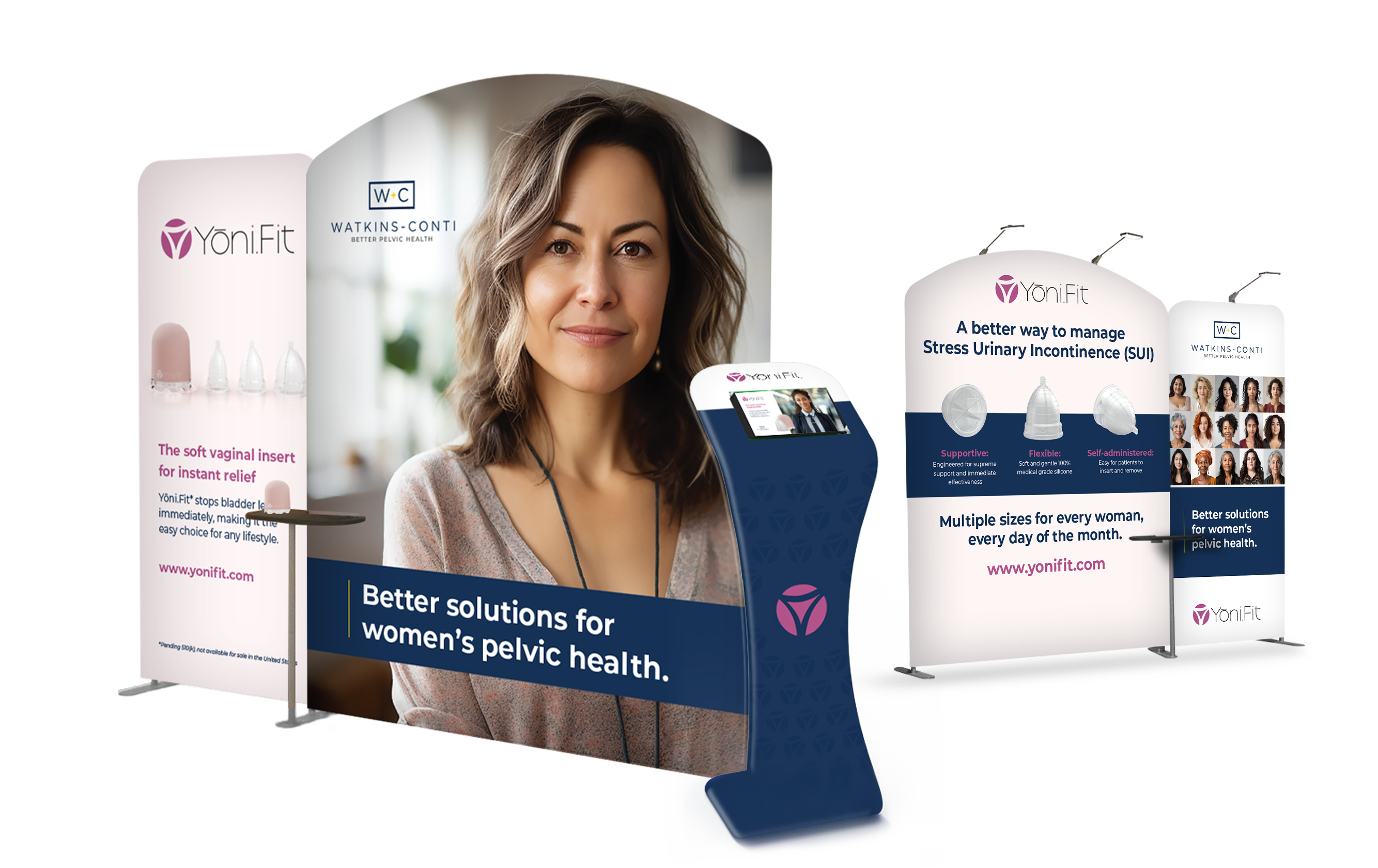
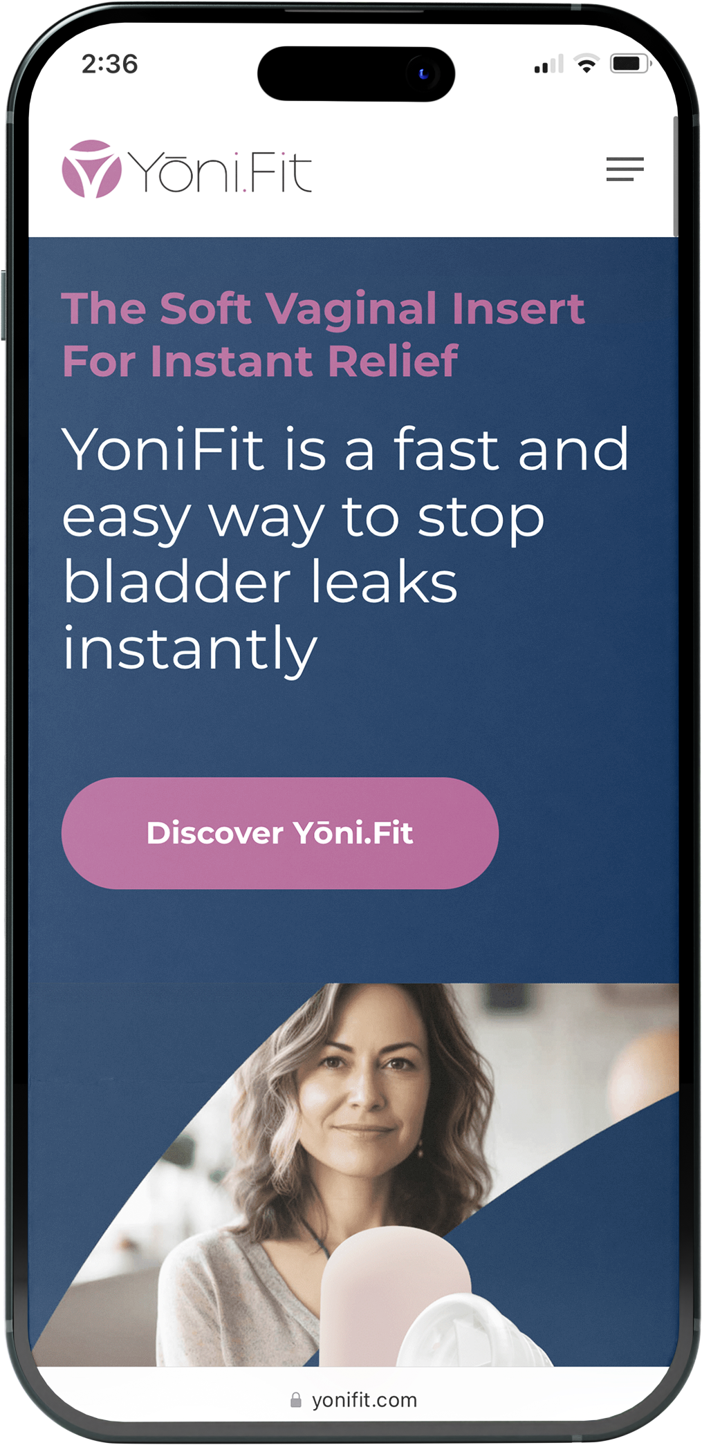
In a mere eight weeks, Asano Designs and Watkins Conti collaboratively rejuvenated the brand. They revamped the trade booth, designed a new logo and tagline, optimized the website and crafted a comprehensive 45-page brand guideline. This transformation not only reinvigorated Watkins Conti’s image but also broadened their reach and impact in pelvic health, resonating powerfully with their audience.
A Brand Transformation for Better Pelvic Health

Our Eight Week Objective
Watkins-Conti approached us with a unique branding challenge, seeking to revamp their brand identity and messaging. Our primary objective: creating a captivating trade booth for an upcoming show. Within an ambitious eight-week timeline, our project scope extended beyond the booth; it encompassed a new tagline, “Better Pelvic Health,” a brochure, website redesign, and a 45-page brand guideline.
Trade Booth Transformation
Asano Designs presented modular trade booth concepts tailored to suit various event spaces. Smaller components were recommended for a 10×6-foot space, while larger components were designed for a 10×20-foot space.
Audience Analysis
- Utilizing generative AI, Asano Designs pinpointed the target audience: women aged 40 to 65 with careers, healthcare professionals, women’s health advocates, investors, and active mothers.
- Specific professions, such as a traffic cop or schoolteacher, were chosen to represent the audience’s diversity and unique challenges.
Website Revamp
- We embarked on the task of developing a user-friendly WordPress website, showcasing product descriptions, patient testimonials, clinical data, a blog, and contact forms.
- This digital space evolved into a hub, serving as a valuable resource for both patients and professionals seeking information about Watkins Conti’s offerings.
Brochure Development
- We meticulously crafted a detailed brochure, providing in-depth insights into product details, clinical data, and authentic patient testimonials.
- The brochure became a tangible asset, perfect for distribution at conferences and events.
Visual Branding
- A customized color palette was designed, enhancing the existing blue and yellow with a pinkish-purple hue that resonated with the audience.
- A comprehensive set of brand guidelines was compiled to ensure consistency across all brand assets.

A Brand Transformation in eight weeks


