After seven years of building its brand and programs to resonate with life sciences and agencies, POCN recognized the need to better engage with nurse practitioners and physician associates. To address this, they developed a mobile app and online platform to help PAs and NPs connect with one another. However, the existing identity lacked the vibrancy and personality POCN needed to succeed. In order to truly embody the spirit of community, POCN needed a new identity system that was bold, engaging, and reflective of their new mission.
From Resource Hub to Community Platform
What We Did:
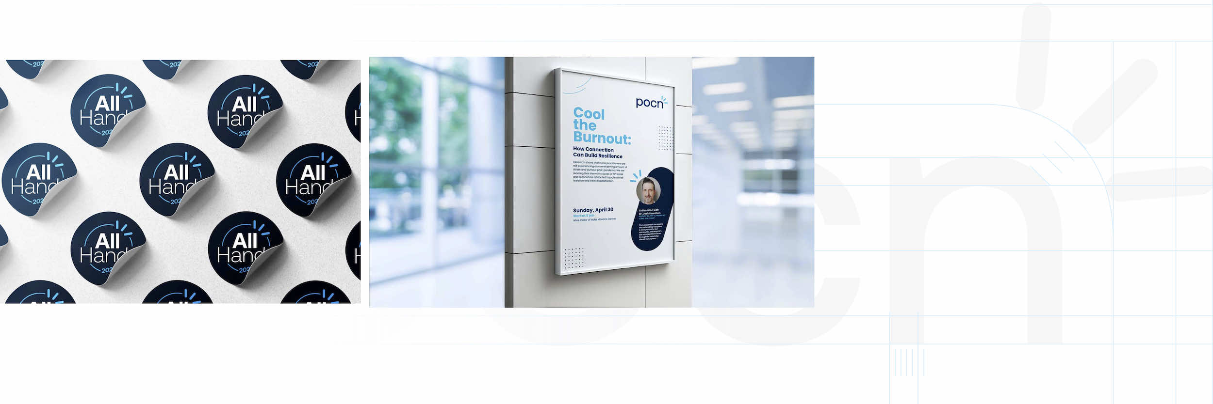
- Brand Identity
- Marketing Communication
- Presentation Slide Templates
- Event Branding Design
- Social Media Design Integration
- Website Design
Challenges:
POCN was in search of a new identity system that effectively conveyed the idea of an active community fostering peer learning and connections. Through our research, we discovered the need to infuse sophistication and professionalism into the brand. The new identity had to possess a unique personality, showcasing the strong sense of community POCN had already established. Moreover, POCN aimed to create an iconic symbol that would capture attention and become synonymous with the brand, fostering a sense of familiarity and trust within the rapidly expanding community of healthcare professionals.
Solutions:
POCN was in search of a new identity system that effectively conveyed the idea of an active community fostering peer learning and connections. Through our research, we discovered the need to infuse sophistication and professionalism into the brand. The new identity had to possess a unique personality, showcasing the strong sense of community POCN had already established. Moreover, POCN aimed to create an iconic symbol that would capture attention and become synonymous with the brand, fostering a sense of familiarity and trust within the rapidly expanding community of healthcare professionals.
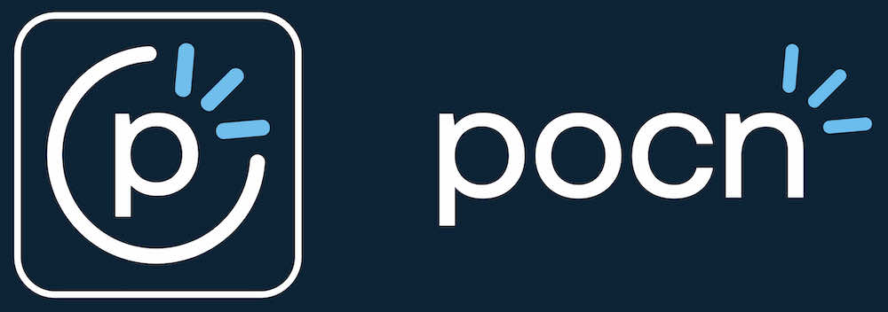
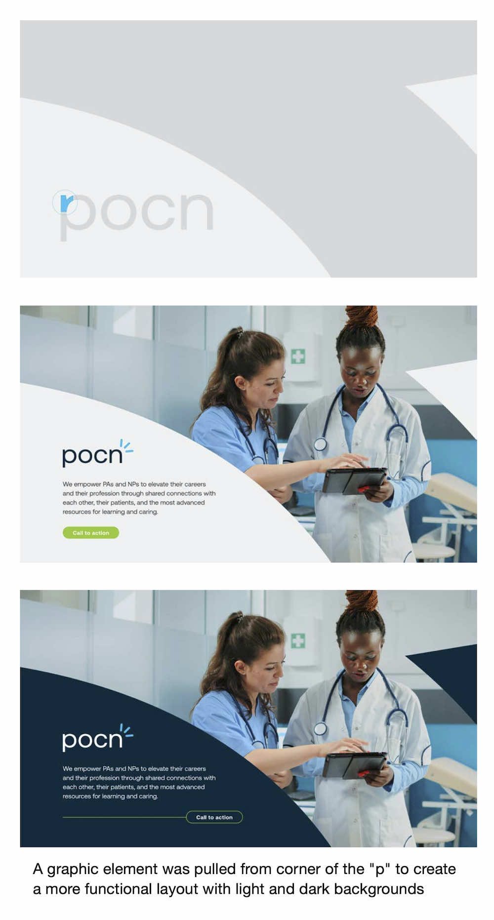
To create an icon that would become recognizable over time, we worked with POCN to develop a symbol that could stand alone and still communicate the brand values. The final design was an abstract version of the spark in the POCN logo.
Results:
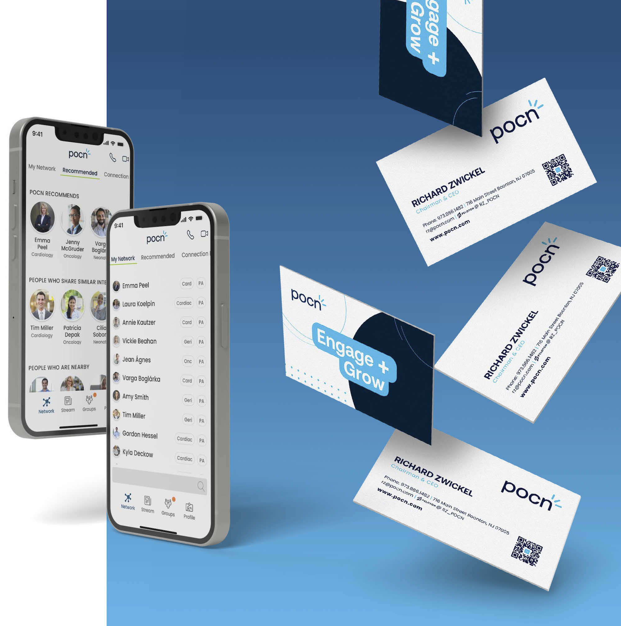
With the new identity system and mobile app development, POCN was able to engage with the community more effectively. The new identity system conveyed the sense of community that POCN had developed and the spark became an instantly recognizable symbol. The mobile app provided a platform for clinicians to engage with each other and access resources curated by NPs and PAs. The app also allowed POCN to communicate with their audience in a more personalized and engaging way.
Conclusion
Our collaboration with POCN resulted in a new identity system that showcased their vibrant community. We strived to create an inclusive brand that not only respected the vital work of NPs and PAs but also provided them with a user-friendly platform. This identity system effortlessly conveyed the essence of communication and engagement, symbolized by the recognizable spark logo. Through the development of their mobile app, POCN successfully fostered meaningful connections among clinicians, enabling them to interact and access valuable resources curated by NPs and PAs. The integration of the new identity system and mobile app bolstered the bond between POCN and the NP/PA community, serving POCN’s overarching mission of acknowledging the invaluable contributions of NPs and PAs in enhancing patient care.
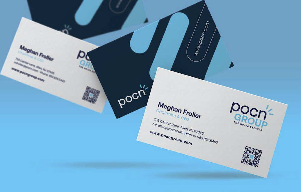
Stationery Design

Sizzle Reel
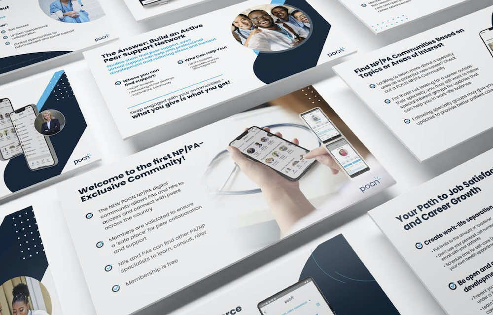
Presentation Layouts