Publicis Health Media
Continually Re-Imagineing Media
Publicis Health Media, or PHM, is a sister organization of Publicis Health. They wanted to move away from their existing identity and differentiate themselves in the medical industry.
PHM hired Asano Designs to reconceptualize their logo and create a brand asset library that would guide the PHM team in all communications and marketing efforts.
PHM is an influential force in the healthcare space with a large team and many outside contractors. They needed a deck of guidelines and assets so they were able to relay their brand to any employee or vendor representing PHM.
We were challenged to create a brand identity that would make PHM stand out and preserve their established foothold in the healthcare industry. We needed to position PHM as a unique player in the industry without isolating them as an outlier when compared to their competitors.
The Strategy
PHM wanted to hit “refresh” on their branding and create a unique identity that still resonated in the healthcare space. They have a large marketing team so it was clear that they needed visual assets and best practices to keep all of their communications cohesive.
We met with the client to understand where the brand had been, what their goals were, and where PHM was heading to inform our design process.
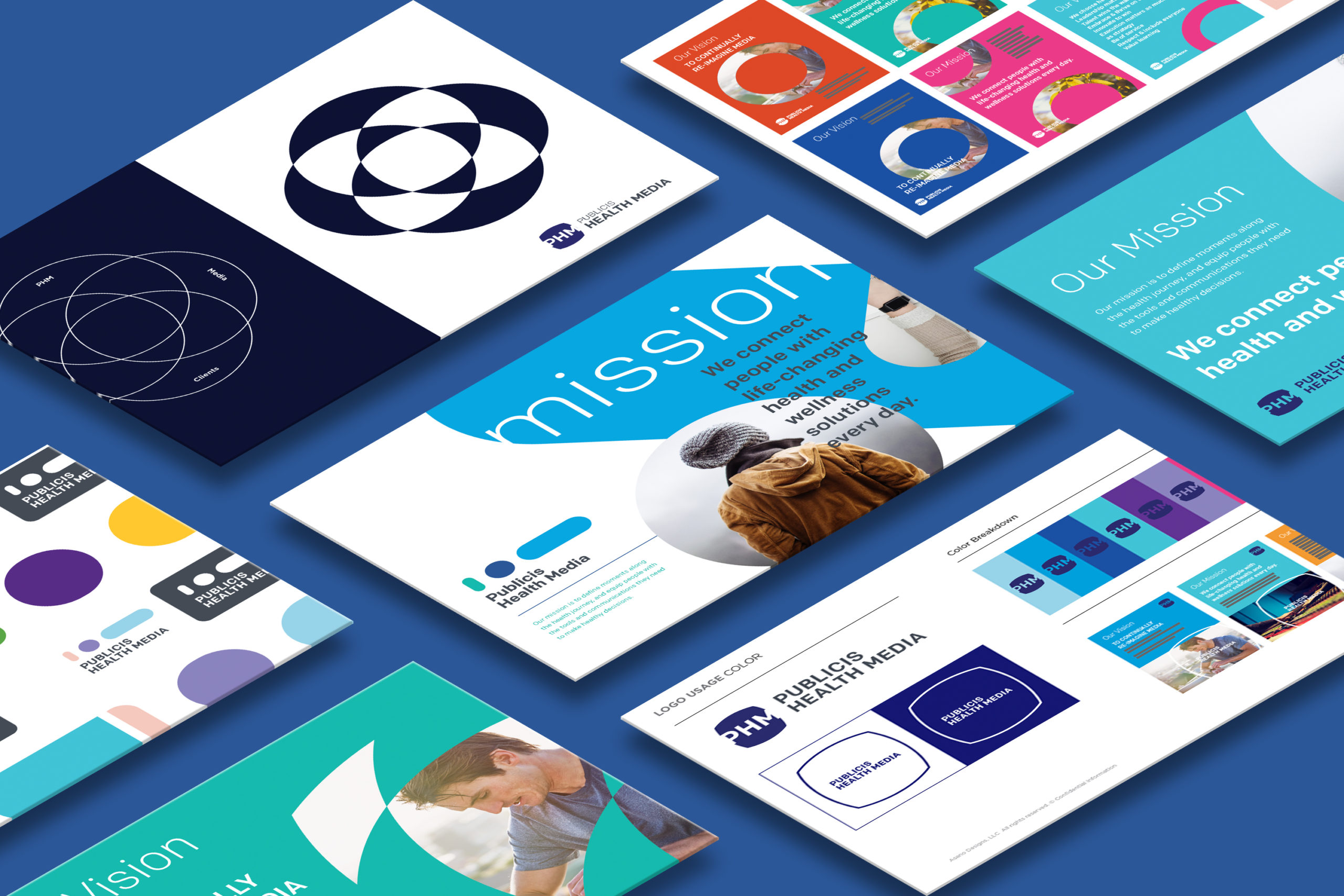
01. Logo and Branding Design
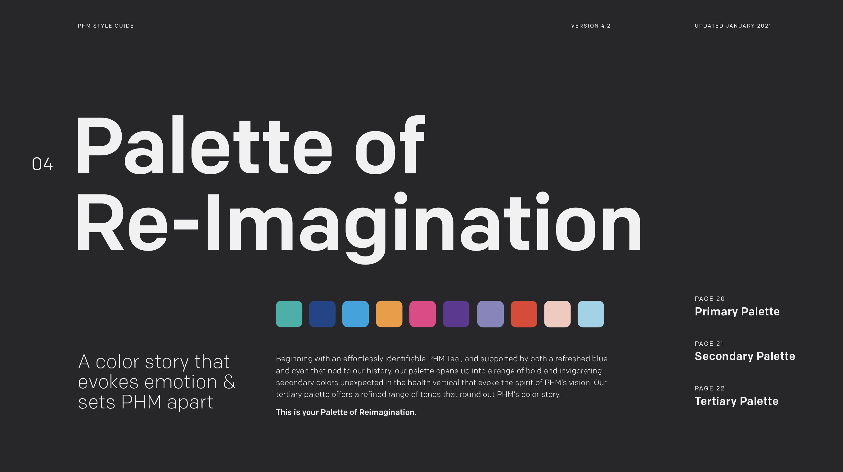
We created different logo concepts to show PHM new ways of thinking about their brand. We researched the trend of colors and fonts in the healthcare space to inform design. We used client feedback and created a new logo, color palette, identity marks, and refined their font choices.
02. Asset Library
We compiled 47-page asset library of visuals and best practices so that their new identity remained consistent across all channels. The marketing team, new employees, and third-party vendors now are able to communicate a cohesive, strong brand identity.
The Solution
Asano Designs worked closely with PHM to ensure that we not only understood the history of the company, but what their goals were for the future of their brand.
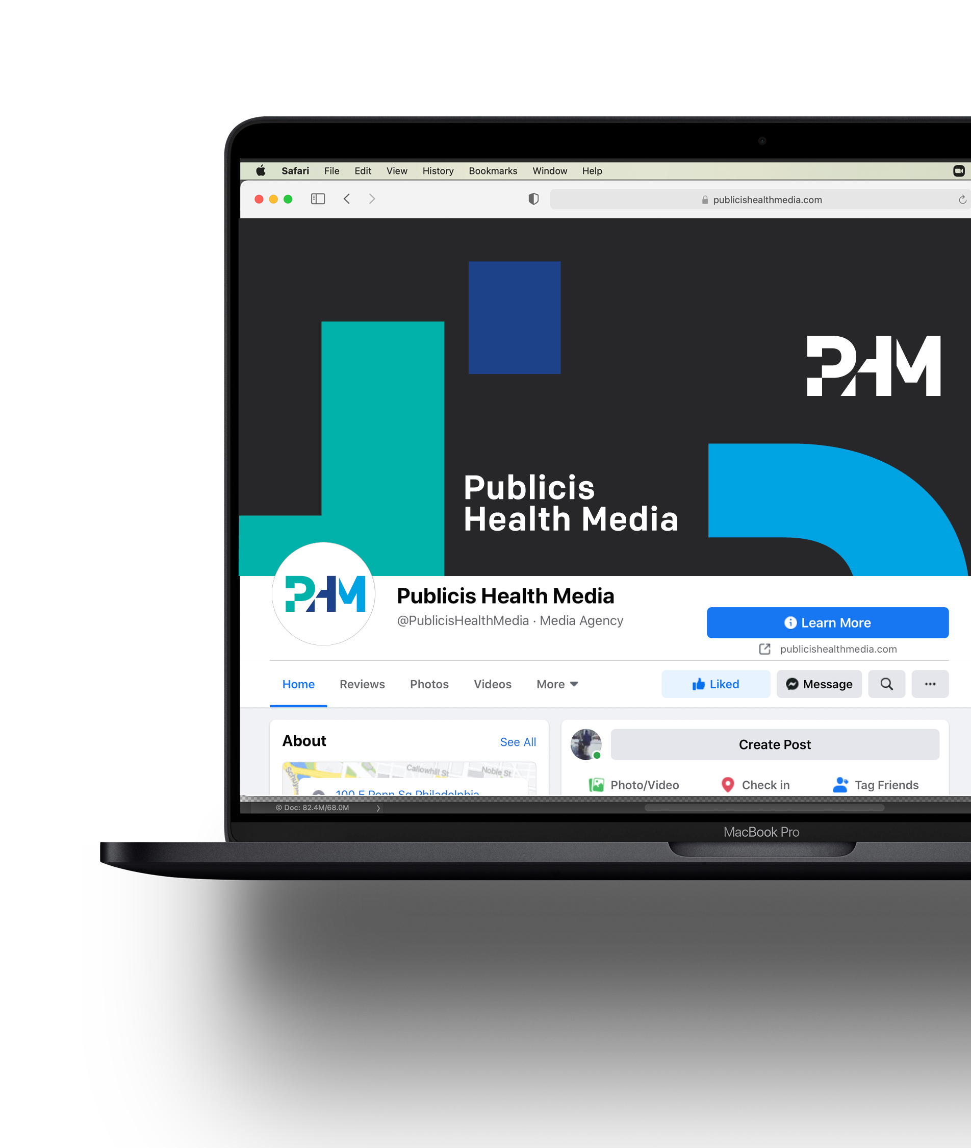
We used past concepts, market research on current industry trends, and feedback from PHM to reimagine their logo and other design elements. We came up with cohesive visuals that resonated in the healthcare space and could be used across all platforms while still remaining a unified voice.
Asano Designs created a unique color palette that positioned PHM as a professional but accessible brand, a sealable logo that could be used across all channels, and a 47-page asset library with images, digital elements, and best practices for employees and outside vendors.
We reimagined the PHM brand with visual designs that help them stand out in the healthcare space while still remaining relevant to the market. We then took it a step further and compiled everything into an accessible asset library.
PHM evolved into a stronger, more cohesive identity through a logo redesign, and they now have a comprehensive guidebook that relays the brand clearly through best practices for years to come.
Asano Designs created a unique color palette that positioned PHM as a professional but accessible brand, a sealable logo that could be used across all channels, and a 47-page asset library with images, digital elements, and best practices for employees and outside vendors.

The Solution
Before
After